What are some of your favorite childhood memories?
As a Millennial, some of mine include pulling up to the famous golden arches of McDonald’s, joyfully awaiting my Happy Meal and toy.
(Well, more so the toy- much to the despair of my mother!)
Another is seeing the iconic Walt Disney Pictures title screen before watching my favorite movie over and over, The Lion King.
Branding subconsciously plays a huge role in being a sort of touchstone of our memories. It’s a part of our memory before we even recognize what it is.
Some of the most effective brands are also the simplest.
Imagine for a second if the Apple and McDonald’s Logos looked like this:
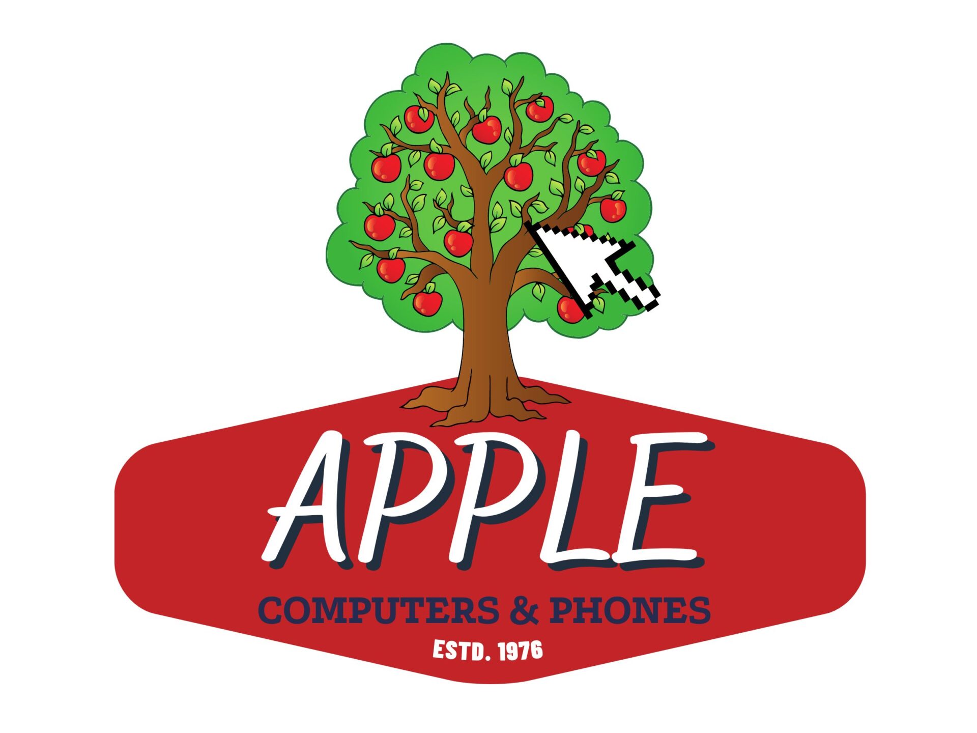
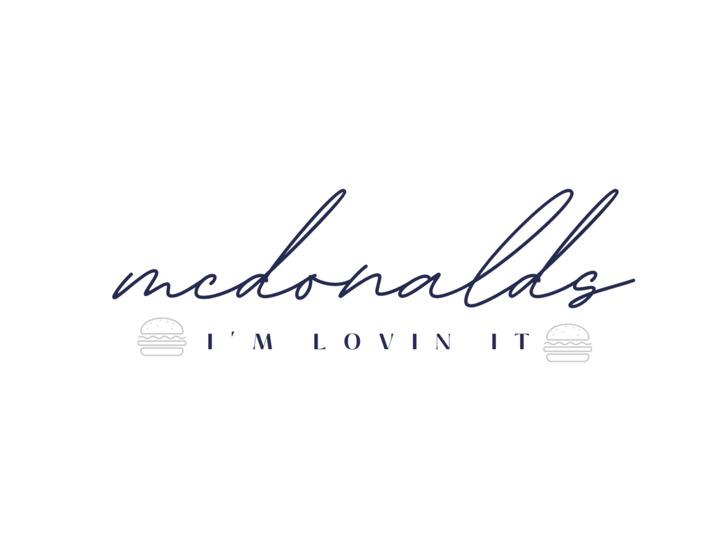
It just doesn’t work, right?
Large companies spend hundreds of thousands of dollars to get their brand just right.When a company is branded well, you will see that in everything from the in-person experience, to digital and print material, and beyond.
That is not by accident, it’s a very well thought out and planned process.
Branding is a place we see small businesses often struggle.
So in response, we want to give you a guideline so that you can make sure you have all the elements in place for a well-executed brand and to know if you’re on the right track. And if not, what exactly you should do about it! These are some of the best ways to build a brand.
1. Logo
The first element of successful a brand is a well-thought-out logo.
It’s hard to imagine a brand WITHOUT a logo. It just doesn’t exist. You need one. Without a logo, you have no identity.
A logo should convey your entire brand’s voice, personality and aesthetic in a single image.
It’s going to be on everything- your website, print material, business cards, t-shirts, magnets, and more. It should be something you’re proud of!
We see many small businesses overlook a logo and say they don’t need one, or they had their 14-year-old niece design one for them.
Do not overlook this! A great logo is the cornerstone of a polished branding presence. If you don’t have any other element of branding, please make sure you have a well-designed custom logo.
And not only that, but a VECTOR logo. You know when you zoom into a graphic and it becomes blurry? A vector design means that it will never do that. You can blow up a vector logo file into a 100 ft. banner and it will look crystal clear. This is something only a professional can give you, and it’s invaluable to your business. Trying to give a graphic designer a non-vector logo to put on a 6-foot sponsor banner will only result in an extra charge for conversion.
So do it right the first time and get a vector logo designed for your business.
[Note: A professional can also convert a non-vector file into a vector file and it’s something we do often. So if yours isn’t a vector, it can be converted before getting to print.]
2. A Color Palette
Color plays an important role in psychology and in how we perceive a brand.
As I mentioned earlier, the golden arches are an iconic part of McDonald’s branding. And it would be hard to imagine Chick-fil-A in any color but it’s bright red! These weren’t choices made at random but strategically thought out by branding experts/.
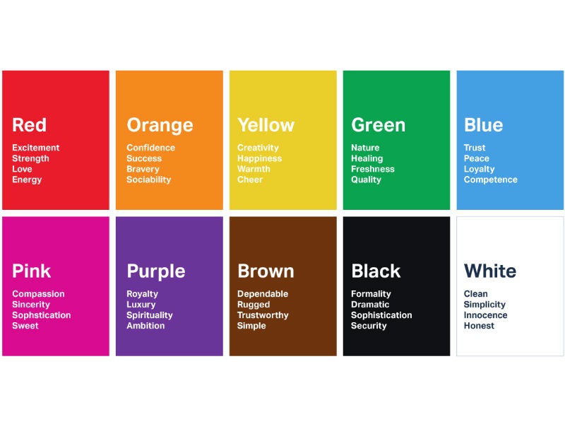
Different colors evoke different responses:
A professional will determine which color would work best in your branding. Often you will have a couple of primary colors, and secondary colors that can be used in things like social media, etc.
You will notice in our personal branding, our primary colors are red and teal, but we’ve recently incorporated some secondary colors for social media and digital use including yellow, and orange. This adds some variety, yet keeps things consistent!
3. Tone/Messaging
Tone and messaging is an incredibly important element to consider. But before you can determine this, you have to decide who your audience is.
If you are a hospice company, the tone will probably be very caring, soft, comforting and sensitive. Your audience is families who are grieving and dealing with severe illness. You don’t want to come across too “fun” or it will be quite jarring.
Conversely, a hip new makeup or trendy fashion brand can get away with being a bit irreverent and use hip slang, etc. in an effort to stand out and not come off stiff.
Messaging is relevant in your website and social media copy, and basically anywhere your brand is presented through the written word. This also includes your tagline/slogan.
We all know Nike’s tagline- “Just do it.”
Red Bull- “gives you wings.”
Chick-fil-a’s – “our pleasure.”
To nail down your messaging, you need to know a few things:
- Your Audience
- Market Trends
- Know Your Value You Bring
Once you know and become aware of these things, you can properly position yourself.
What are your core campaigns going to be? Are you targeting the over 60+ crowd who is heading into retirement? Your brand messaging is going to be different than something targeted towards college kids.
An interesting case in a brand’s tone and messaging that subverted the typical style is with the water company Liquid Death. Their slogan is “Murder your thirst.”
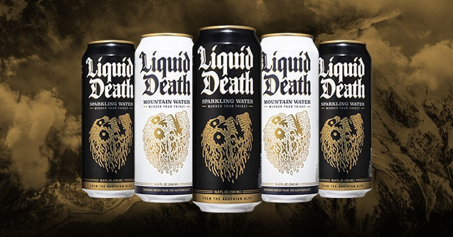
I’ve been personally seeing this EVERYWHERE at recent events, music festivals and concerts where every other person is holding a can of beer.
It stands out among other water bottles. I remembered it from the first time I saw it.
That’s the power of branding.
4. Font
Fonts, case structures, and even spacing between letters play a huge part in branding.
Take the Liquid death example- the font plays a huge role in that. Imagine how goofy it would look if the font was like this:
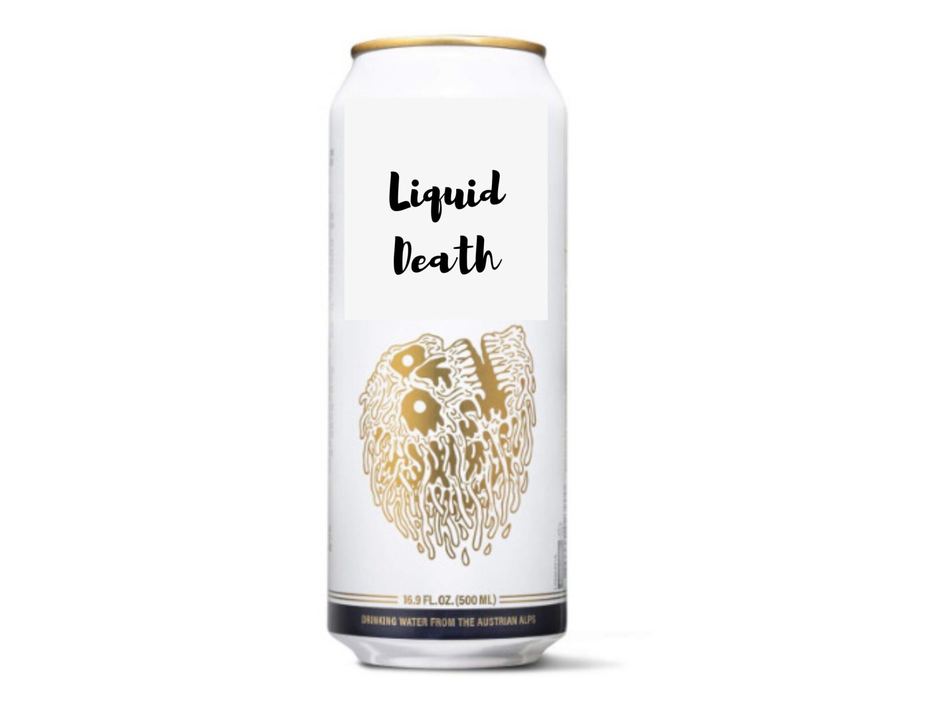
Just doesn’t quite have the same impact, does it?
Choosing the right font for your print and web material can go a long way in evoking the correct feel for your business.
Uppercase, serif fonts with lots of space tend to evoke luxury, sophistication. Perfect for a law firm or a luxury fashion brand.
Take this example:
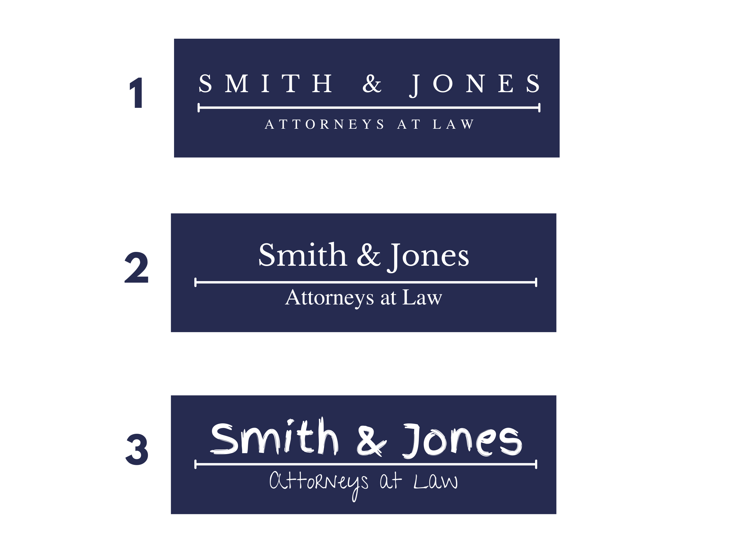
Example 1 and 2 are actually both the SAME font, but manipulating the case structure and spacing makes all the difference.
Doesn’t the top one look more high-end? #3 looks like something made for kids. The only difference in all of the logos is the font. That’s how important it is!
If you LOOK high-end, people will want to pay high-end prices.
Here’s another example:
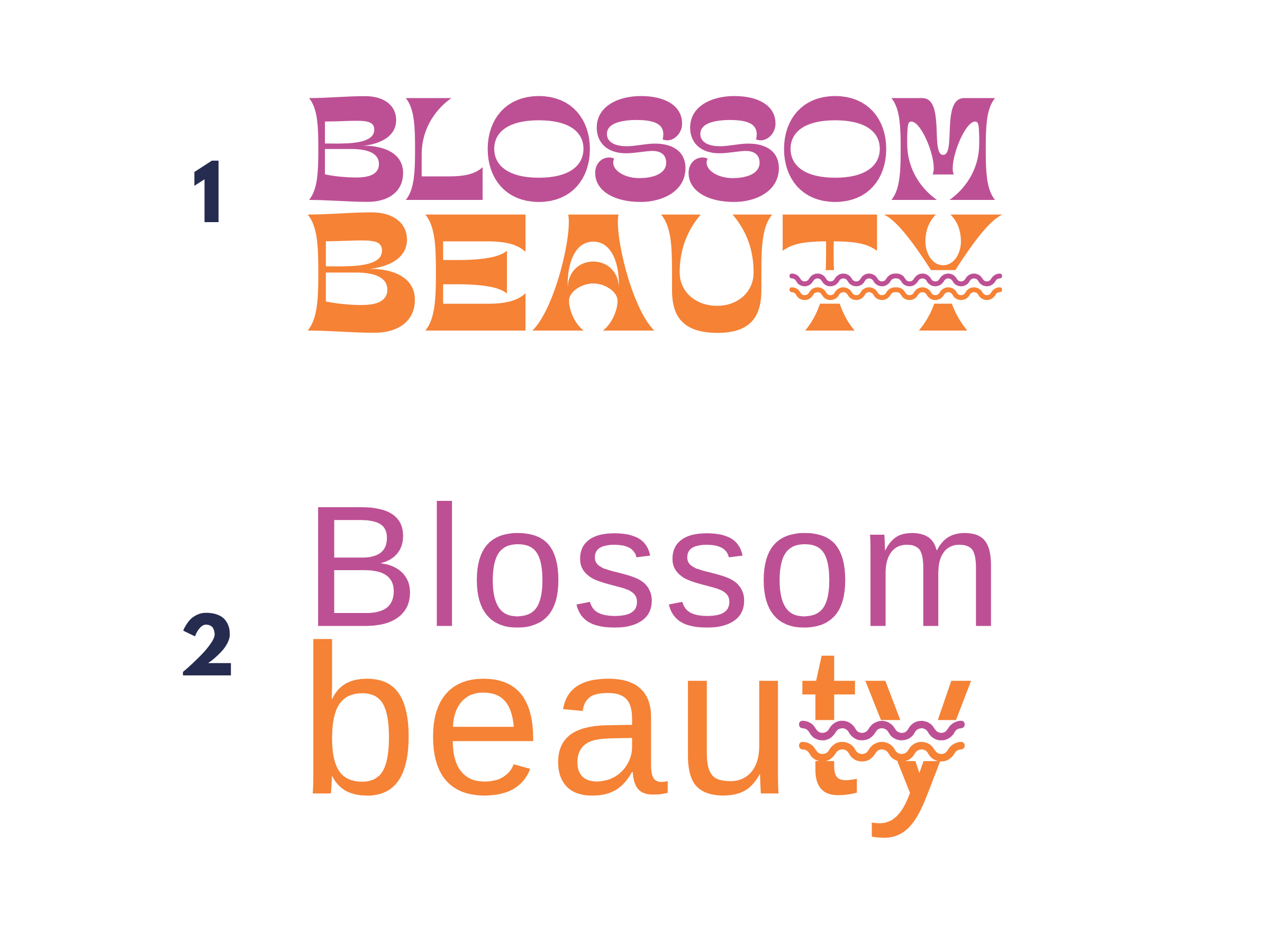
Say you’re a hip new makeup brand targeting Gen-Z and young millennials. You want something fresh and funky. In this case, a trendy 70s inspired font works well. Example 2 looks a little off. It’s bland, uncreative, and doesn’t quite fit. It won’t attract that target demographic.
Sure, customers aren’t branding experts but they can feel when a logo doesn’t quite match.
Customers want to do business with a company that knows what they are, what they offer, and how to communicate that effectively.
5. Imagery
The old adage “A picture says a thousand words” is still true when it comes to branding.
When you visit a website with beautiful photos and video content, it draws you in, engages you, and makes you feel that the company is “legitimate,” right? Conversely, if you come across a website with blurry, dark photos that are very inconsistent in look and feel, it makes you think that they just may not care.
Creating a unified look and feel for your imagery for your website and print media can go a very long way in conveying your brand’s feel, the “vibe-“ and conveying a sense of professionalism and unity. We feel the *best* way to get unified imagery is to hire a professional to take photos of your billing, staff, product, etc. However, we know sometimes this isn’t possible.
If you can’t afford a photographer, another great resource is stock photography websites. You would need to select images that look fresh, relaxed, friendly, welcoming. (Of course, some specifics depend on your industry.)
Also, keep in mind your color palette! If you are a bright, fun makeup company, you will want to make sure your photos also evoke this.
And if you are a formal law firm trying to evoke a luxe atmosphere, dark colors and architectural details work well.
Let’s say you’re a brand new restaurant. You want to launch a landing page to promote your restaurant but don’t have professional photos yet. How can you convey your branding with imagery?
Example 1:
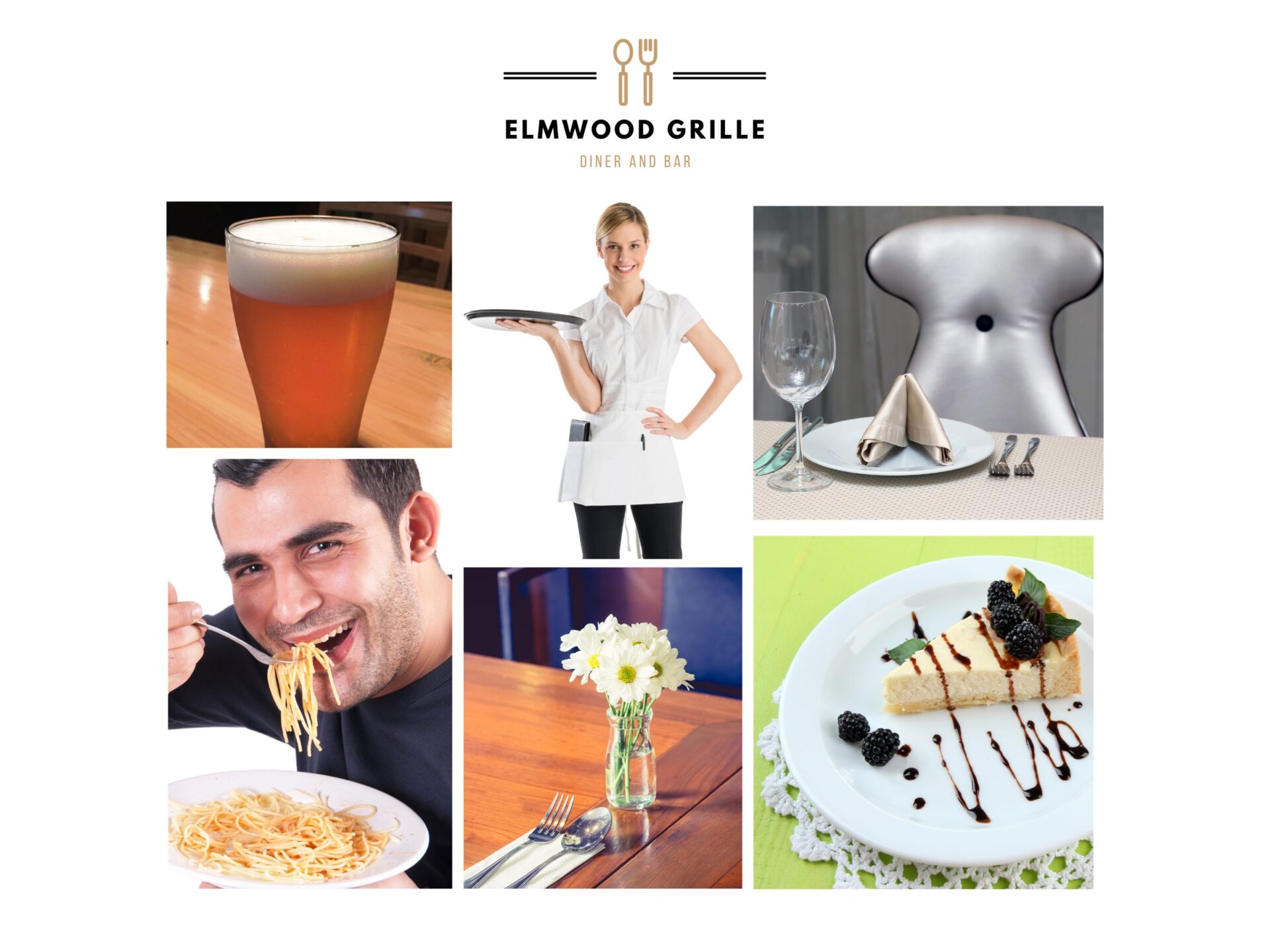
As you can see, all the images are inconsistent in color and feel. They’re not very inviting. They don’t tell us anything about the brand. They also…make you uncomfortable? Slightly ominous? Mysterious?
Now, Let’s look at some examples of some good imagery.
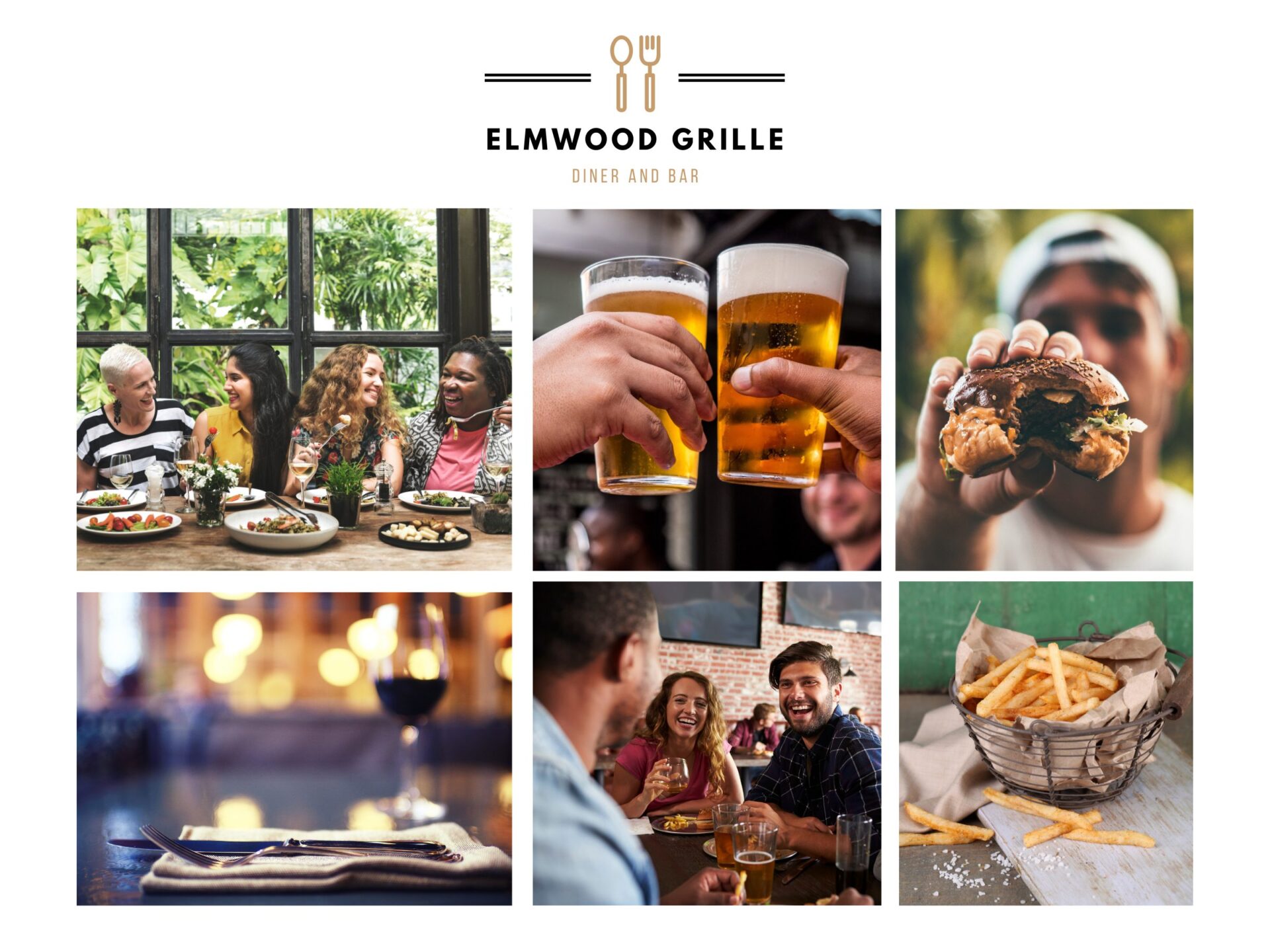
Right away we get a feel of the general vibe of what kind of restaurant we’re getting. Something casual, yet nice. Warm, welcoming, inviting. High quality yet down to earth.
This is solely based on imagery alone!
A note on copyright law: It’s extremely important to note that you should never directly pull something from Google search to use in your website or social media. Copyright law is no joke, and there are companies that solely trawl the internet looking for unsuspecting people who accidentally used something without paying for a license.
Here are some stock photography sites we recommend:
*these are free. But bear in mind that many other businesses are using these images so if it’s something really brand establishing like website slider images, we definitely recommend premium stock photography or custom photography.
Paid stock photography sites:
- stock.adobe.com
- canva.com (The Premium offering)
- shutterstock.com
—
“Wow, this is so much. I’m just a small business- this is all so overwhelming!”
We get it.
As an agency, we work with businesses from solo-prenours to international companies.
We offer branding services from creating a single logo file all the way to creating full-scale branding packages, print material, video content, web design and more.
Want to work through some of these items to know where you stand?
Download our free worksheet below to help you navigate the world of branding to make sure you have all of your boxes covered. If you answer “no” to most of these, we’d love to chat and create a custom branding package for you to get you to the next level.
-Janine, VP/Creative Director
