Websites- everyone’s got one, right?
Do you ever stop to wonder why that is? Why organizations still require websites even in these days of ever-present social media? Why businesses spend a lot of time and money to make sure that they have a pretty, meaningful, and functional website?
The answer is that websites are a key part of accomplishing an organization’s overarching goals.
Maybe you want your potential clients to be excited by what they see thus turning them into a customer. You might run a non-profit and want to appeal to your potential donor’s heart. Maybe you need online functionality to deliver a key service that allows your customers to do business with you.
Your website can help you do all of these things.
Now, think about the things that make a website truly great. Things that help you accomplish your business goals by enticing your visitors into becoming more.
The answer is three-fold: beautiful design, meaningful and high-quality content, and it works as expected. You need all of these elements to turn a website visitor into a customer, donor, or subscriber.
First, let’s talk about website design.
People want to look at pretty websites. Period. If your website isn’t pretty, people will leave your website and whatever you intended to do with your website- sell more, attract donors, provide a service- will simply not happen.
Second, you must have meaningful and high quality content.
Consider this- if you’re visiting a website that has poorly written words, the wrong business hours, and bad images, are you going to stick around? The answer is probably no. It doesn’t help your restaurant if your listed business hours are wrong or there are poor quality images of your food. It doesn’t help your service business if the text on the page is full of typos and so jumbled that the user isn’t sure what you’re trying to communicate.
Third, you want your website to function.
If a user tries to submit a contact form that doesn’t work, you’ve lost the opportunity to engage that user. When you’re trying to sell products online, and your shopping cart doesn’t do anything when someone tries to check out, then you’ve lost that sale. What happens if a potential donor tries to donate to you and gets a credit card processing error? Guess what? You’ve lost the donation.
Great websites have all of these things going for them- they’re beautiful, meaningful, and functional.
It’s how you convert a user to a customer, client, or donor. It’s why a high-quality website is so important and how a great website helps you achieve your business goals.
If you want that great website- the one that is gorgeous, you hire us to help you out. We create great websites all the time and love helping our clients achieve their goals!
Below are some case studies of clients that we’ve helped achieve their goals with our Country Fried touch.
Take a look at how we helped Georgia Peach Truck grow their million dollar business with their e-commerce website:
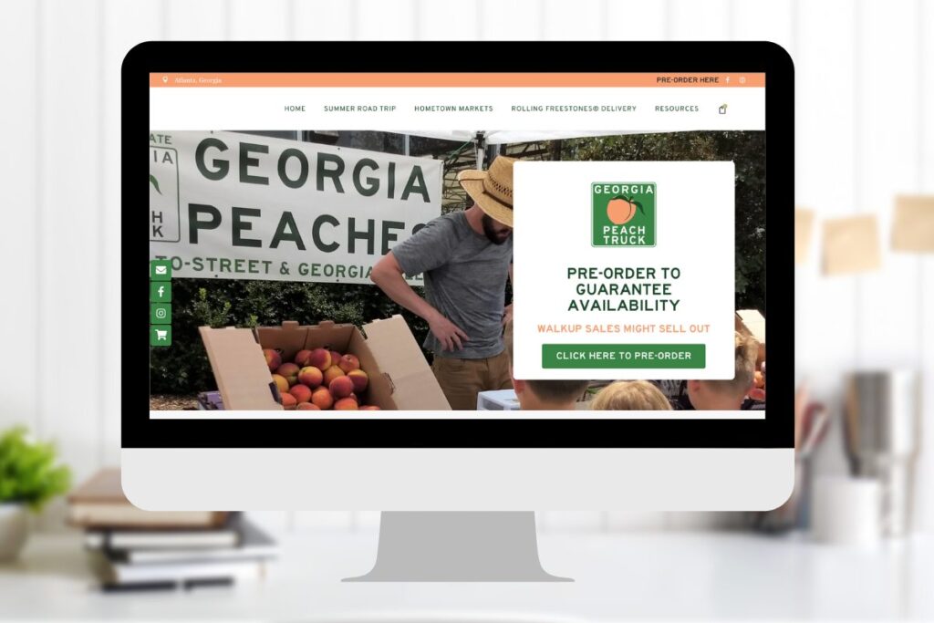
Problem: Georgia Peach Truck initially came to us with a business logistics problem- they didn’t have a website and they had to pivot their business to offer contactless sales as a result of the COVID-19 pandemic and social distancing measures at a number of their host locations. They could no longer only drive their truck to a road stop event and sell peaches to a long line of waiting customers- they needed to provide a safe and efficient way to sell those peaches to people.
Solution: We worked with Georgia Peach Truck to build them a website that allowed them to take pre-orders and accept payment online. It includes a locator map to see where peaches are being sold, allows online check-out, and a backend dashboard that allows their staff to see all pre-orders placed through the website.
Results: Using their new website, Georgia Peach Truck offered a contactless pickup process and controlled the numbers of people who showed up at a set time making the process of selling peaches more efficient and safer. Now, they can also better plan for their sales instead of risking taking too many boxes of peaches that wouldn’t sell or not enough boxes for the demand to their stops- the end result is less waste and more profit.
Heirloom Market and Bakeshop
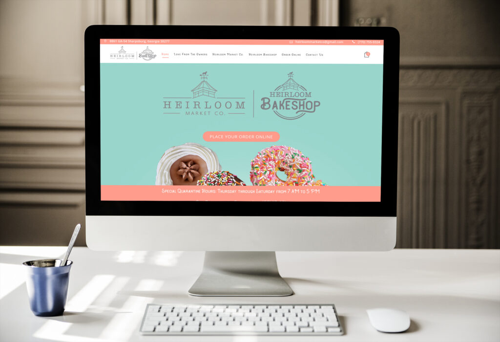
Solution: We built Heirloom a website that was beautiful and accurately portrayed both their unique character and offered visitors information about their donut drop service.
Results: Heirloom was able to expand their donut drop-off service and created an online presence for their business. The donut drop-off was so successful that they’ve turned that into a permanent business offering. Their website also has a personality that sets them apart from other bakeshops compelling and converting visitors to customers.
Christian City
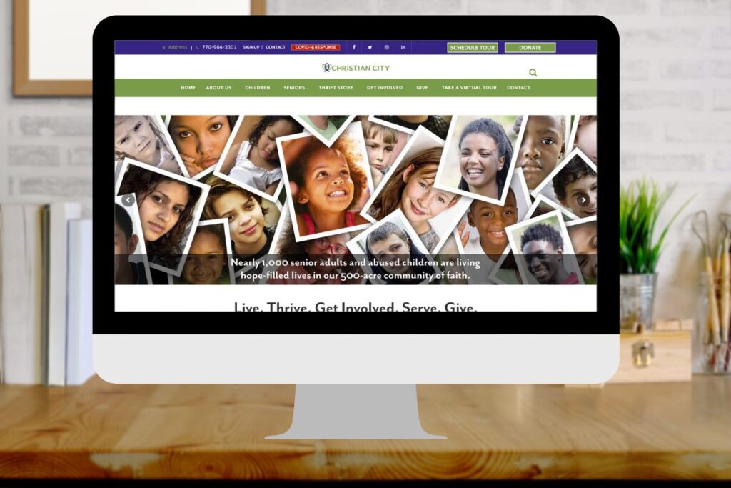
Problem: Christian City came to us needing to have a cohesive, accurate, and relevant website to represent their organization. They had several websites for each of their services. These websites didn’t create a sense that they were one organization with one mission. The goal to extend Christ’s call to love your neighbor. They achieve this through housing, health care and crisis intervention for children, families, and older adults. They also needed a better way to support their mission through online functionality.
Solution: We built Christian City a website that consolidated their online presence, highlighted their organizational purpose, and provided needed information. We included information about their campus, community, services, and initiatives to all of their target audiences. We created functionality that would help minister to their audiences. For example, we turned emails into devotional posts. We specialized form functionality that would allow them to make online appointments for visits. Additionally, we and provided crisis information accessed through a QR code.
Results: Christian City now has a website that communicates that they are a cohesive organization with a specific mission. Also, it provides quality content that helps them deliver the information and services that each of their various audiences needs. They can more easily accomplish tasks that support their mission- offer crisis intervention information to at-risk youth through a QR code, set up appointments for seniors to visit their senior living community, and help facilitate online donations.
